Wednesday, November 26, 2008

Student Show Postcard

Front

Back

I designed these for class.  They are in the running against other student submissions to be the postcard that UM uses to promote this year's Student Art Show.

Monday, November 24, 2008

Bo Lundberg Pattern


I made the tree pattern in Illustrator for class and turned it into a dinner plate in Photoshop.  The assignment was for us to look through a book of patterns and then create our own after an artist whose style we liked.  I chose Bo Lundberg.  He creates simple designs out of everyday objects.  His works feel retro to me, but are clean and modern at the same time. His designs mainly play with silhouettes and transparencies through the use of solid blocks of color.

Thursday, November 20, 2008

Yearbook Yourself Ads

Square 1/4 Page

Horizontal 1/8 page

11X17"

These are a few example of the designs I made to advertise the October portrait dates for the Ibis Yearbook at UM.  They were used for flyers and posters and were put in student publications like the Hurricane newspaper.  I made ten slightly different versions altogether because there were ten different ad space sizes available to us.  I used the popular website "yearbookyourself.com" as inspiration for the tag line and the silhouette.

Wednesday, November 19, 2008

Thank You Postcard

Thank you!

I designed this postcard for my internship at UM's College of Arts and Sciences.  It was sent out to thank those donors who gave $100 or less to the COAS.

College of Arts and Sciences Notecard

I made this notecard for my internship with UM's College of Arts and Sciences.  They wanted a redesign of their old card.

Figure


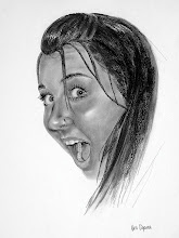
These are a couple samples from the figure drawing class I took a couple summers ago at the Waldron Art Center.

Magazine Spread - Lines and Planes

Lines and Planes

This is a class assignment.  We were to take photos of lines and planes, and then use them in a magazine layout called "Lines and Planes."  The copy is filler text because it was a quick, in-class assignment.

Magazine Spread - Uncle Who?

Uncle Who? The Story of a Paranoid Schizophrenic

This is a magazine spread I made for class.  I made the photo-illustration out of old school portraits my mom gave me of my uncle.

Little 500 Brochure

Inside Flap, Back Cover, Front Cover

Inside Left, Inside Middle, Inside Right

For this class assignment, we were to create a brochure.  I chose to feature the event called The Little 500, which is an annual bicycle race that happens back home at Indiana University.  I made the brochure long and thin to make it look like a ticket to the event when the brochure is all closed up.  I found the photographs online, but I made up the logo for the event.  The back cover is made of fake advertisements I designed.

The Daily Ibis

The Daily Ibis - 
The Election Series: How well do you know your candidates?

I made up the newspaper "The Daily Ibis" (after the University of Miami's mascot) for my typography class.  The assignment was to layout a newspaper.  I wrote all the stories and drew the caricatures, too. 

Design Tile - The Dirty Table


The assignment for these design tiles was to experiment with a short phrase using handwritten typography.  I superimposed the words "The Dirty Table" (which I wrote with a marker on paper) on photographs I took of dirty surfaces I found around my house using Photoshop.

Shot Book


Cover - 
Jamie's 21st Birthday Shot Book

Sample Page - 
Shot 1: You're almost legal. Take a shot!

Sample Page - 
Shot 2: You're definitely not drunk yet. Suggestion: Take another shot!

These are from a book I designed for a friend of mine's 21st birthday.  Each page is numbered with whichever drink number she is on. The idea was for her to fill in the blanks with what she drank, where she drank it, when she drank it and then to sign her name.  The goal was to reach 21 drinks because it was her 21st birthday.  Naturally, the further along in the night she got, the less neat and tidy her answers got.  I had a hardcover copy printed for her to take out with her on her birthday.  The book is 30 pages long altogether.

Snowboards

Dimitrije Milovich - board's bottom
 Est. 1972 - board's top

Bottoms Up - board's bottom
 Snurfer Dude - board's top

Tomatoes - board's bottom
Shaun White - board's top

The first board I designed was in honor of Dimitrije Milovich, who is credited with starting the first company to ever sell what are now known as snowboards in 1972.  The second board I made was in homage to snowboarding's history that connects it with surfing.  The term "snurfer" came from combining the beginning of the word snowboarder with the end of the word surfer.  The last board I made was to honor Shaun White, an accomplished snowboarder who has won gold medals in both the Olympics and in the Winter X-Games.  His nickname is "The Flying Tomato" so that's the rationale behind the tomato imagery on the bottom of the board.  

I tried to make the bottoms of the boards bright and colorful to add excitement to when snowboarders do tricks that show the bottoms of their boards out on the white snow.

Starkist Redesign


Original made to fit an 8X8" square format

Redesign #1

Redesign #2

This project was to take a canned meat label and redesign it.  First we were to make it fit within a square format, then we were to make two redesigns. I went with StarKist Tuna.

Rusty Lace Catalog

Cover

Inside Cover

Sample Spread

I made this book for class.  We were supposed create a catalog, so I made up the clothing company "Rusty Lace".  I found the images of the women online and extensively photoshopped all of them. I drew the flower on the inside cover and the font is one I created myself called "Old Relic".  The catalog is 24 pages long in all.

Regina Spektor CD

Inside flap, Back Cover, Front Cover

Inside left, Inside Middle (CD holder), Inside Right

The assignment was to design a CD case for an artist.  I chose one of my favorite singers, Regina Spektor.  I took elements from her music videos and drew them to keep her style consistent. 

Reform Logo


People for Major Government Reform

I made these for a class assignment.  We were to pick a cause and create a logo for it.  I made these a year or so back and made a couple different versions. 

Design Tile - Rob and Big

Rob and Big

This tile was done for a class assignment to investigate unconventional size relationships.  The MTV show Rob and Big came to mind when I got the assignment.  The show features professional skateboarder Rob Dyrdek and his best friend/bodyguard Christopher "Big Black" Boykin.  Rob is a small guy (5'7") and Big is rather huge at 6'6" and 375 lbs.  I made this in Illustrator.

Lobster Party Invite

The Lobster Party: Join us for fresh caught lobster and champagne

I made this e-invitation for an event promoter.  He was throwing a party to celebrate the mini-lobster season.  He asked that the diver resemble himself and for there to be a chef, girls partying and of course a lobster and champagne.

Font Poster: Old Relic

Old Relic

This is a font that I created myself.  I named it Old Relic and made a typewriter for the poster because the font's style is inspired by old typewriters.

In the Loop

In the Loop

This is the first In the Loop spread the magazine Distraction had (Spring 2008), so I chose to take the title literally and make a loop in Illustrator and put the words in that loop.

In the Loop

In the Loop

This is a divider page that got printed in the Spring 2008 issue of distraction magazine.  The section is called "In the Loop" and is typically a hodgepodge of different things going on. This particular one spoke about post-graduation plans, summer barbecue ideas, saving your money, recycling, and the olympics.

Hurricane Blog Logo

blogs.themiamihurricane.com  - way beyond ink and paper

This is the logo for the blog of the University of Miami's student newspaper, The Hurricane.

Zodiac Symbols (continued)

Virgo -  The Virgin

Taurus - The Bull

Zodiac Symbols (continued)

Scorpio - The Scorpion

Sagittarius -  The Archer

Pisces - The Fish


Libra - The Scale

Leo - The Lion

Zodiac Symbols


Aries - The Ram


Cancer - The Crab


Capricorn - The Goat


Aquarius - The Water-Bearer


Gemini - The Twins

These are illustrations of zodiac signs that I made for Distraction magazine.   My task was to make the signs out of people instead of using the abstract symbols you normally see.